

Reimagining Grainger’s Cutomer Set up form
Role
UX designer
Tools
Figma
Duration:
3 months (Jun 2025 - Aug 2025)
Client
Grainger
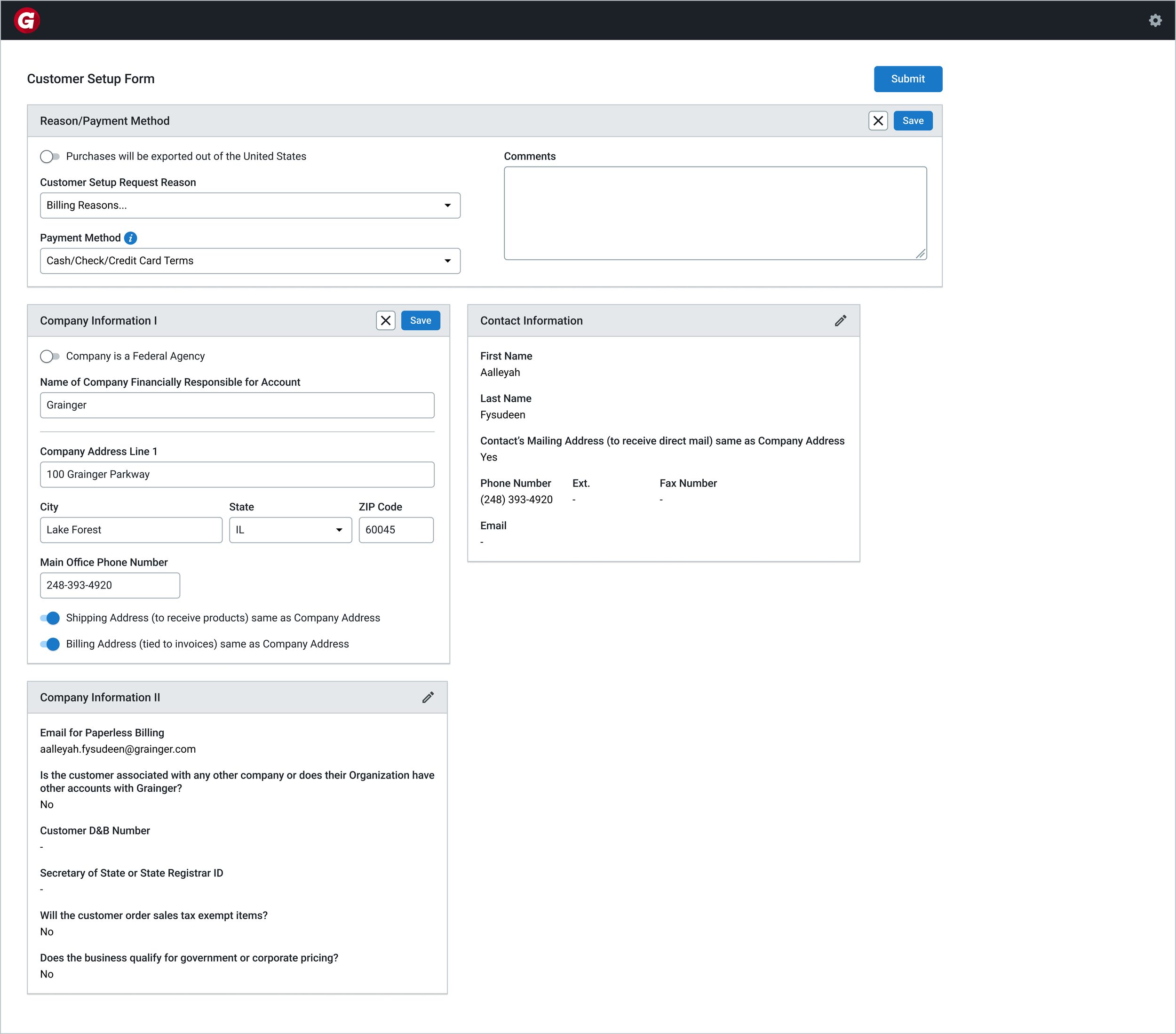
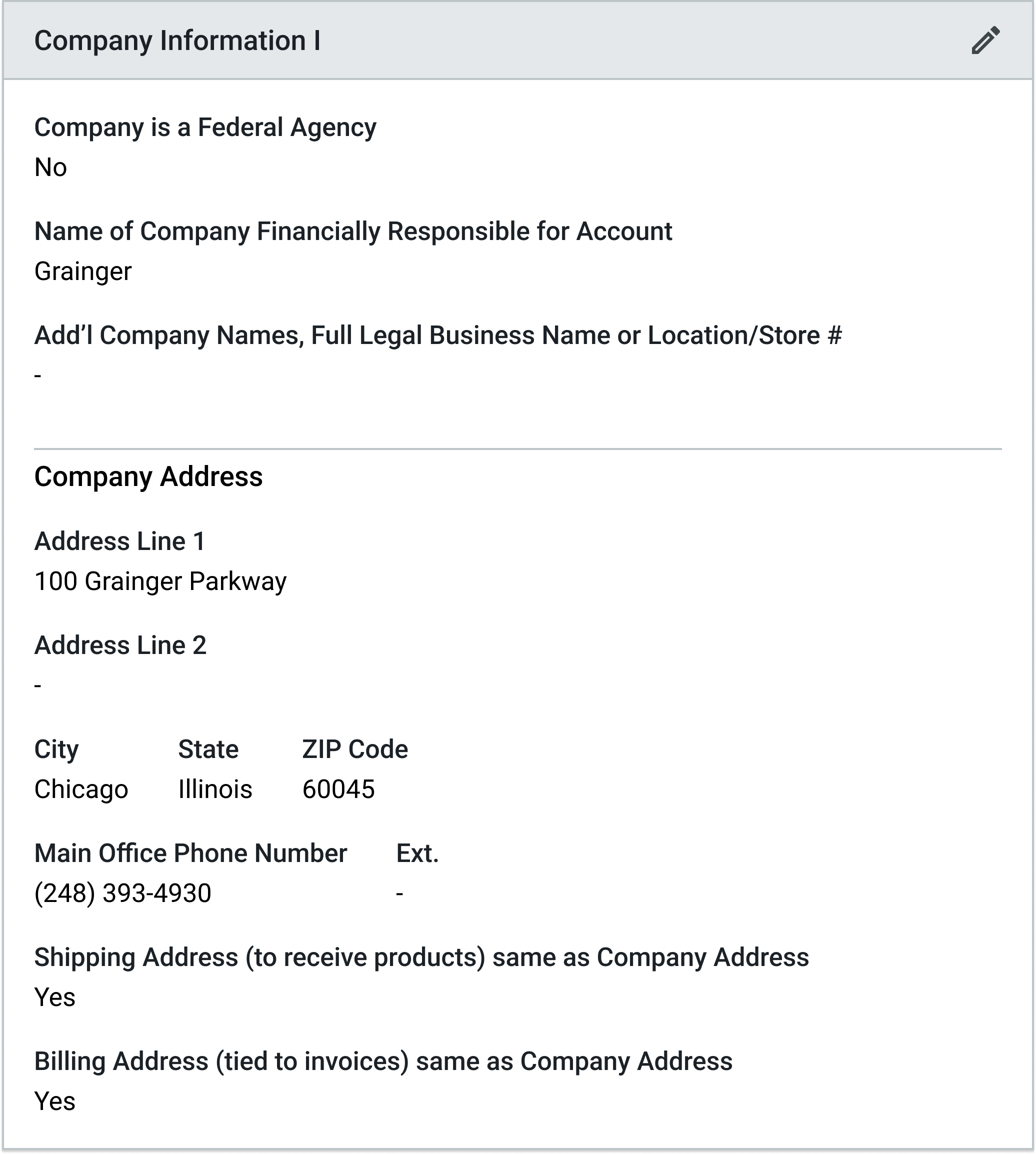
As part of my UX Design Internship at Grainger, I redesigned the Customer Setup Form by identifying privacy risks in mirrored in-branch workflows and introducing a system-driven solution to protect sensitive data and streamline customer verification.

Over 80% of data breaches are caused by human error.
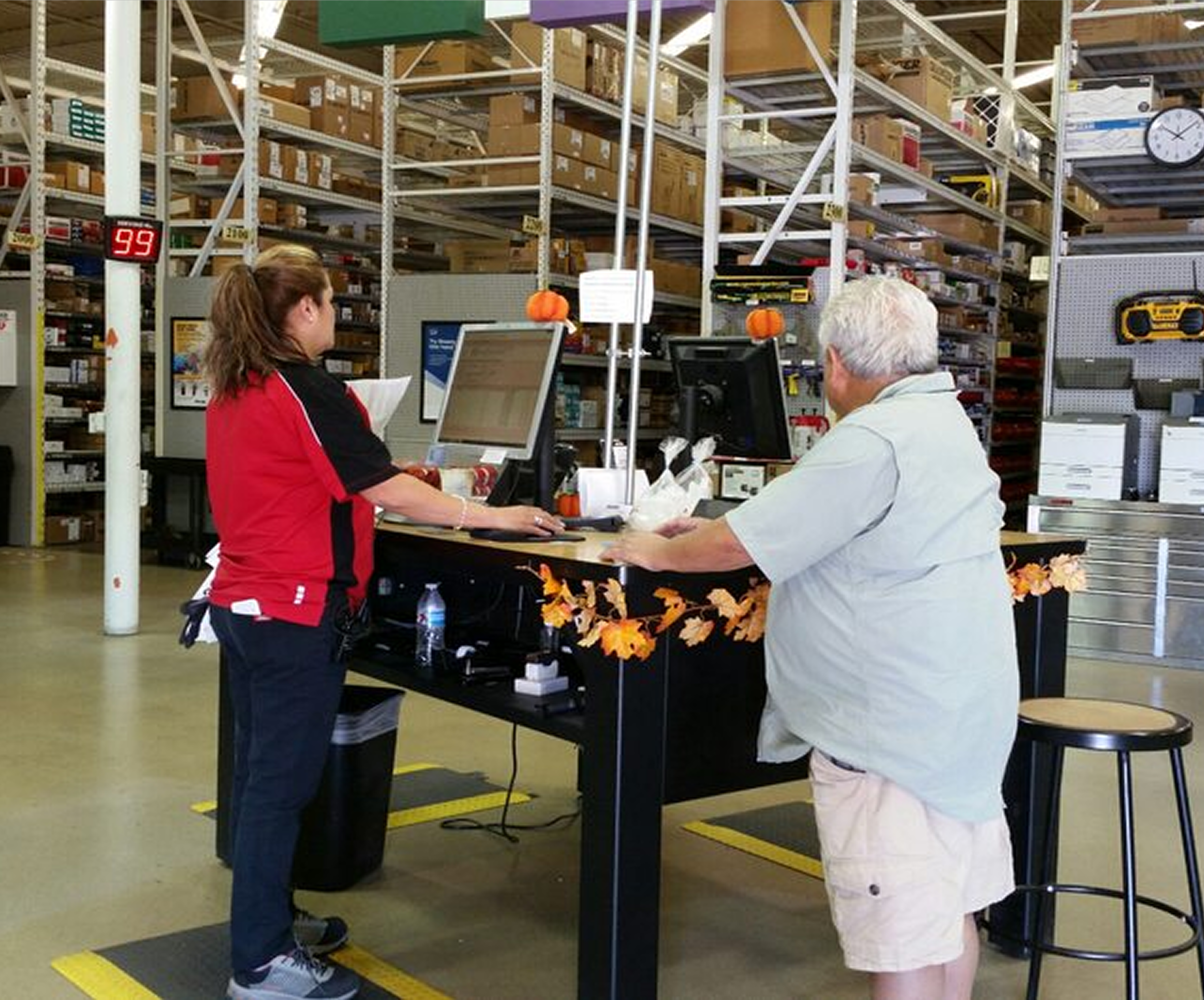
In Grainger branches, employees create customer accounts on mirrored screens—where sensitive information can be unintentionally exposed during entry.

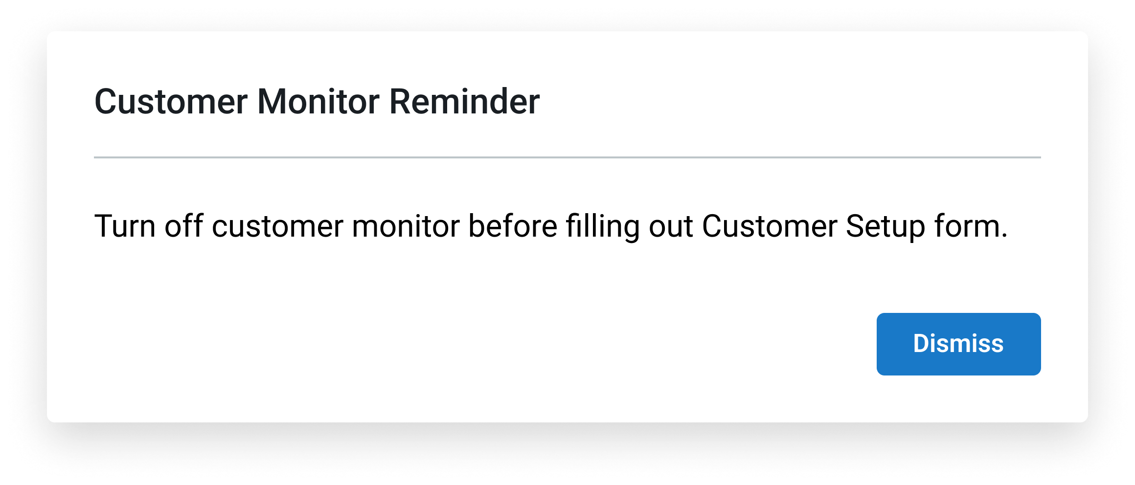
Privacy protection relied on inconsistent manual behavior.
Employees were expected to turn off the customer-facing monitor when entering sensitive information—but during my branch visit, I observed this was not consistently practiced.
This created:
High risk of exposing confidential data
Constant back-and-forth between having to toggle the screen on/off
No clear moment for customers to review their information at the end


Redesign the workflow to protect sensitive data without disrupting in-person collaboration.
The solution needed to:
Maintain a smooth, conversational experience
Reduce cognitive load for employees
Standardize privacy practices across branches

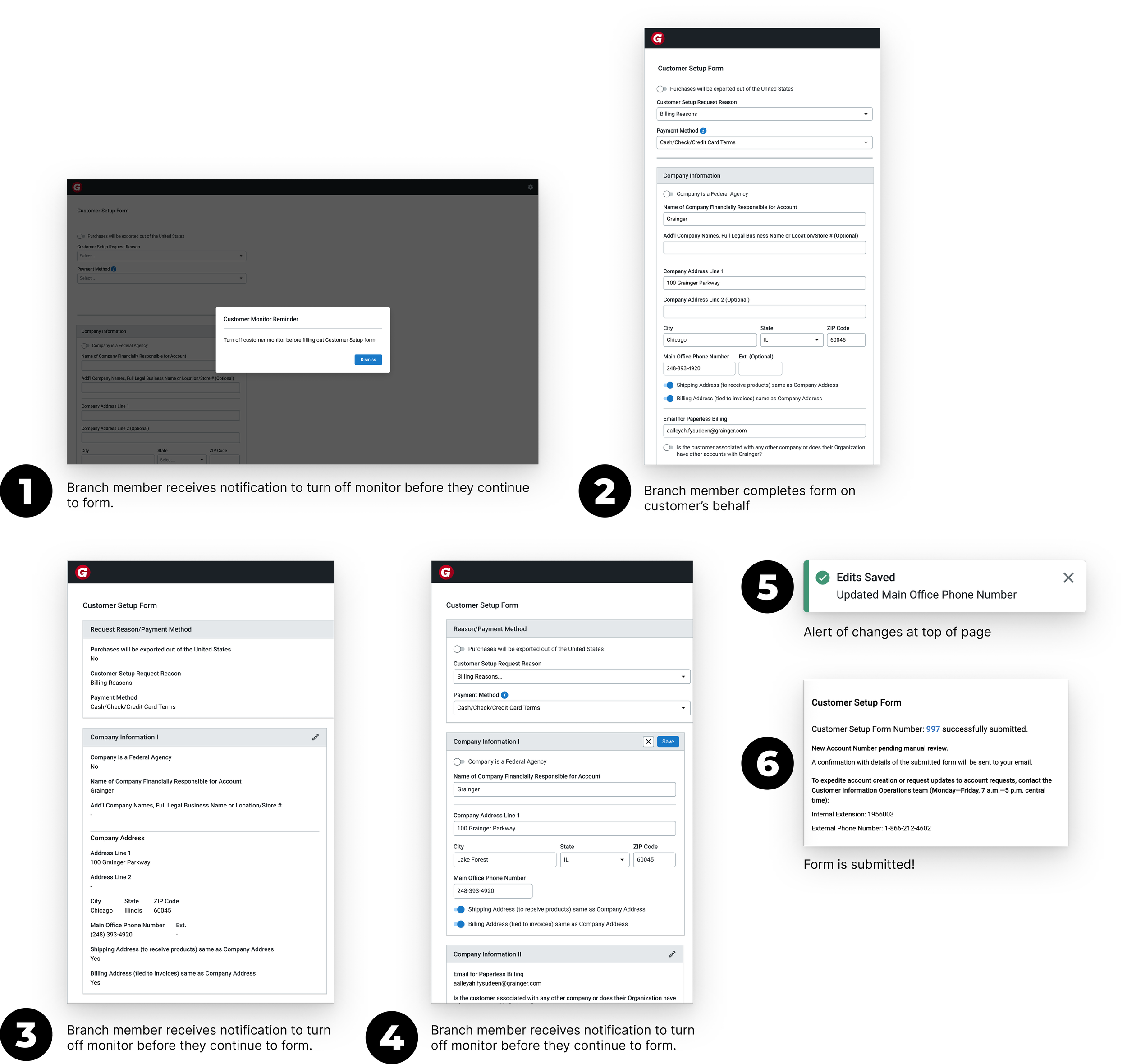
A guided privacy flow that separates sensitive input from customer verification.
Measuring Success
As a result, my designs established a more structured and privacy-aware workflow for the Customer Setup Form.
While the solution was not fully implemented during my internship, my research and final designs helped guide future improvements to the CSF experience, and I had some short term wins over my 3 months:
1: 100% task completion for employers to complete critical tasks
2: 2 UX Bugs submitted and picked up by engineering

I kicked off the redesign by asking: What is the CSF experience really like?
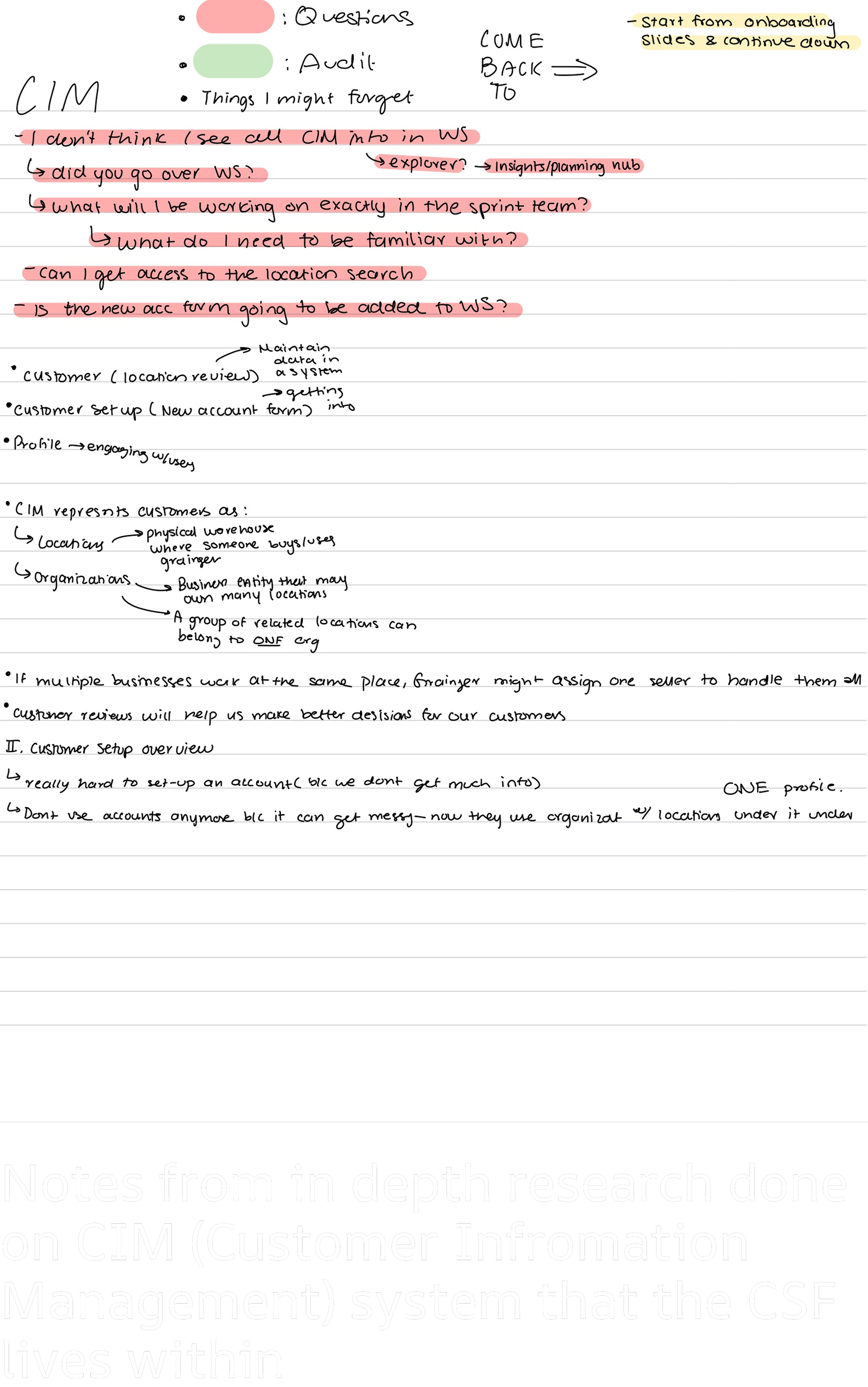
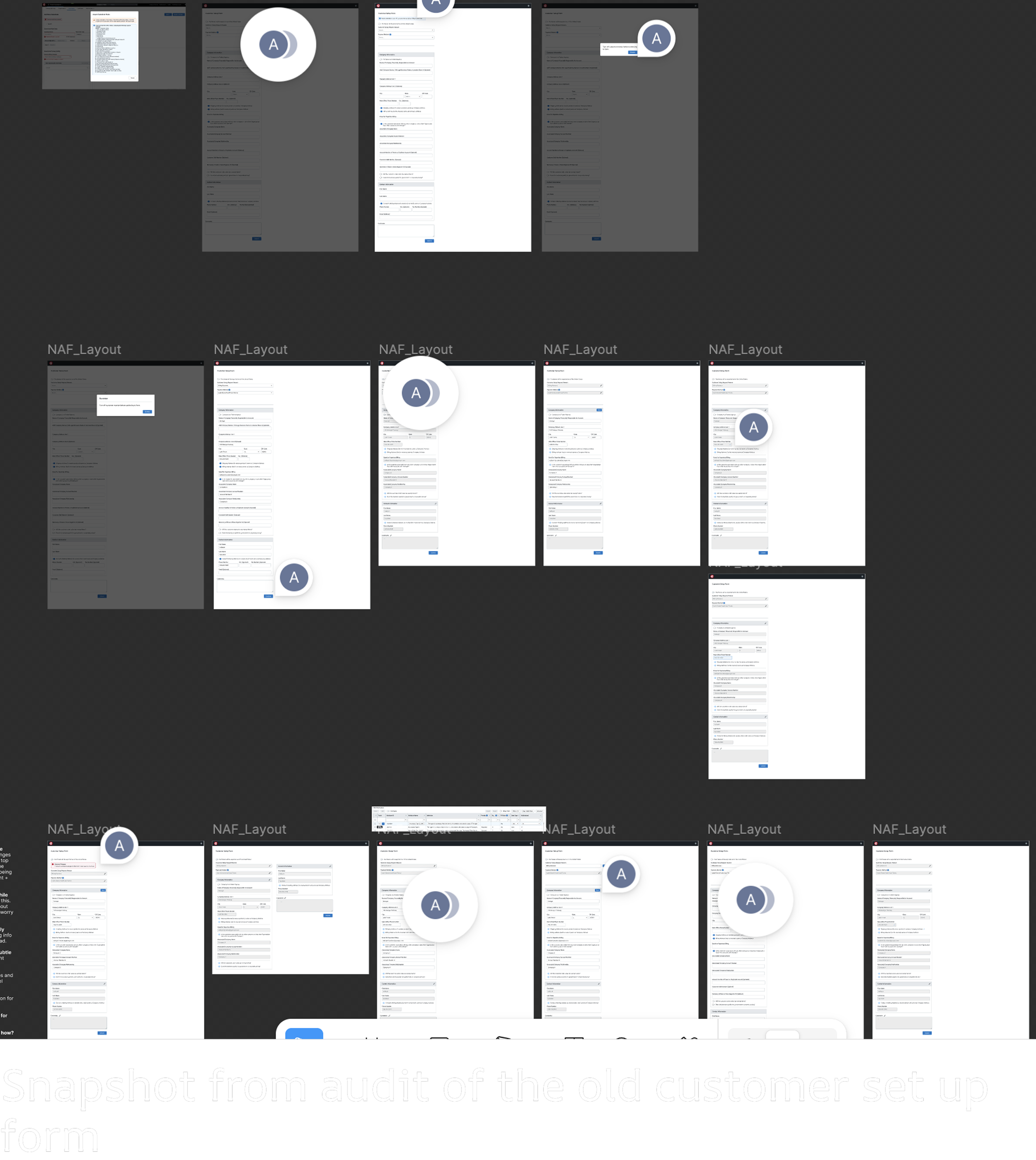
Before jumping into solutions, I dug into the system. I talked with internal users, explored CIM and how SAP organizes data, and took detailed notes on workflows and gaps. I also performed a detailed audit of the current form, annotating the files to flag areas of strong functionality versus those that needed improvement. This gave me a clear map of opportunities before I started designing.
To understand the real-world context of the Customer Setup Form, I had the chance to go in person and observe employees as they created new accounts and interacted with customers. I shadowed branch members and call center agents, taking detailed notes on how they navigated the form, handled sensitive information, and verified customer data.
These are some of the questions that came up as I shadowed the members:
“How do you ensure sensitive customer information is protected when using mirrored monitors?”
“What steps do you take when a customer needs to review their information?”
“Have you encountered situations where the process becomes confusing or error-prone?”
“Which parts of the workflow take the most time or feel repetitive?”

Based on my research, these were the key insights: employees knew privacy best practices, but inconsistent habits, screen toggling, and a lack of a clear customer review moment created friction in the workflow.

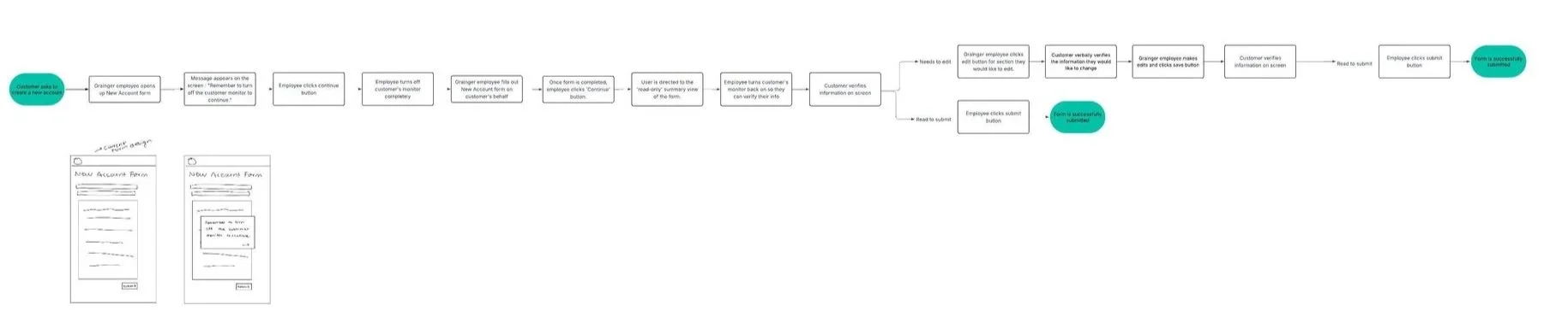
User Journey
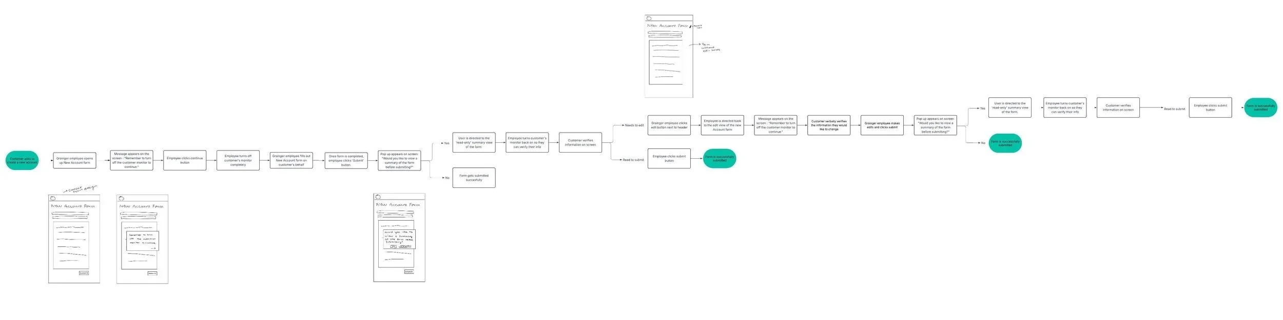
Because this workflow involved both physical and digital interactions, I created a detailed user journey map to capture each step of the experience. I paired each stage with interface sketches to visualize how the screen would adapt and clearly communicate my design decisions to senior stakeholders.
Iteration # 1
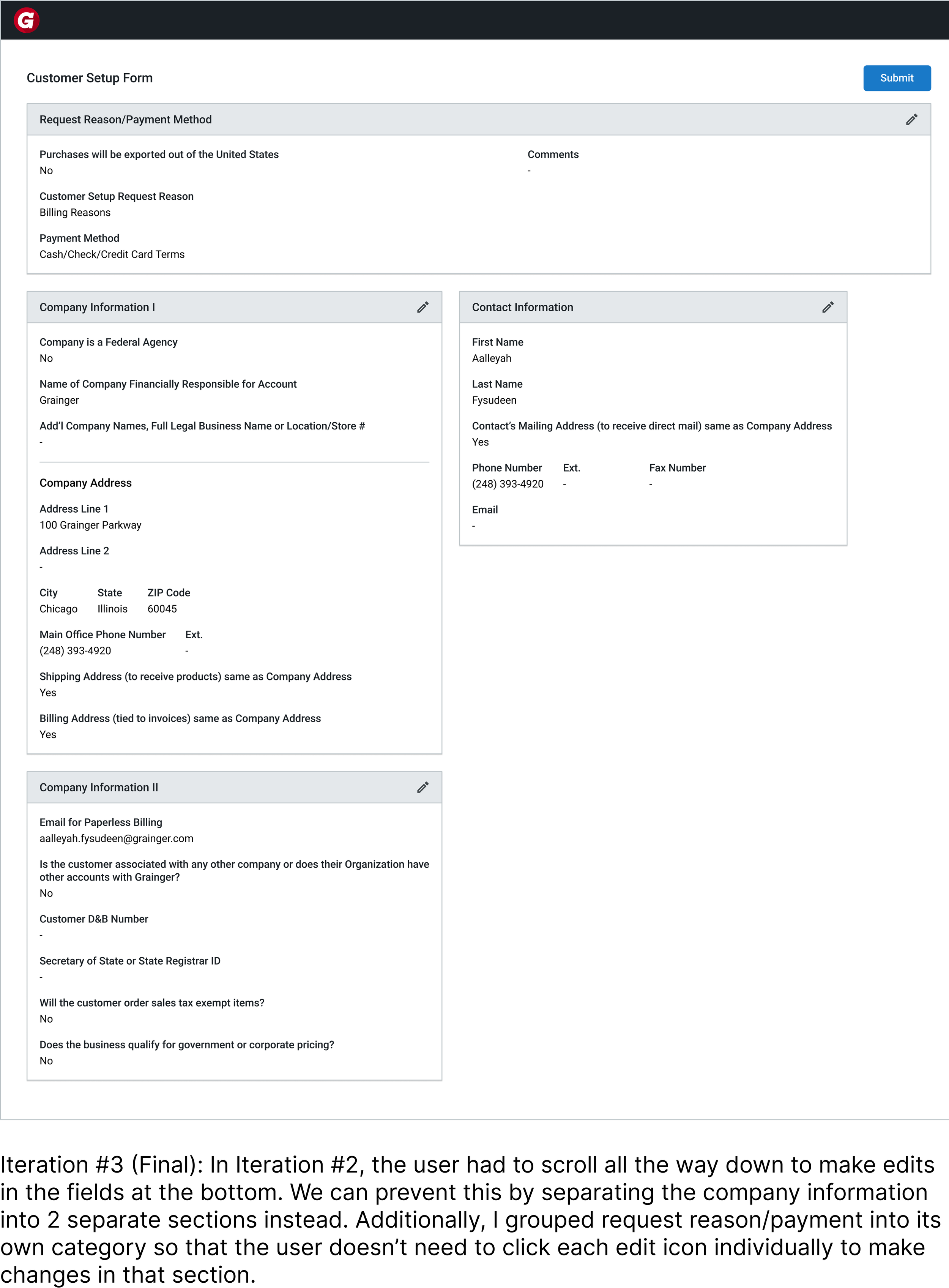
Iteration # 2
From the first to the second iteration, I streamlined the flow by removing unnecessary screens, reorganizing key steps, and refining the overall structure, ultimately reducing it to less than half the size of the original flow.

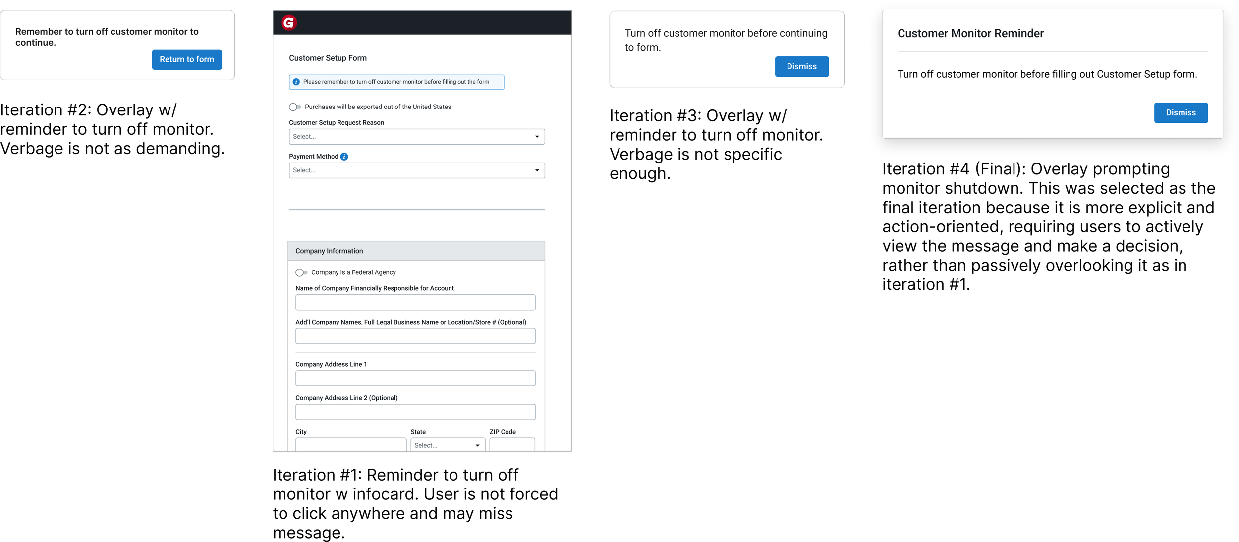
Deciding how to design the message for branch members to turn off the customer monitor to make sure it is an active effort.
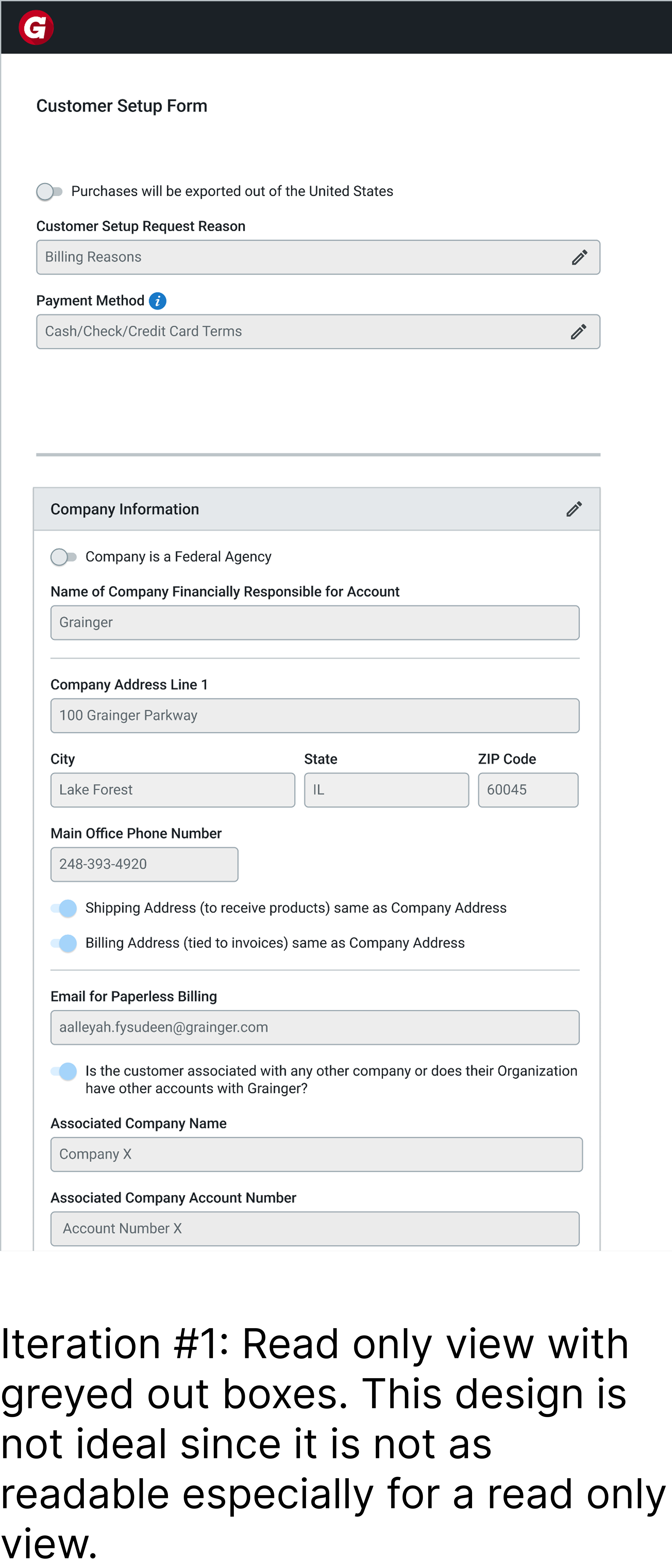
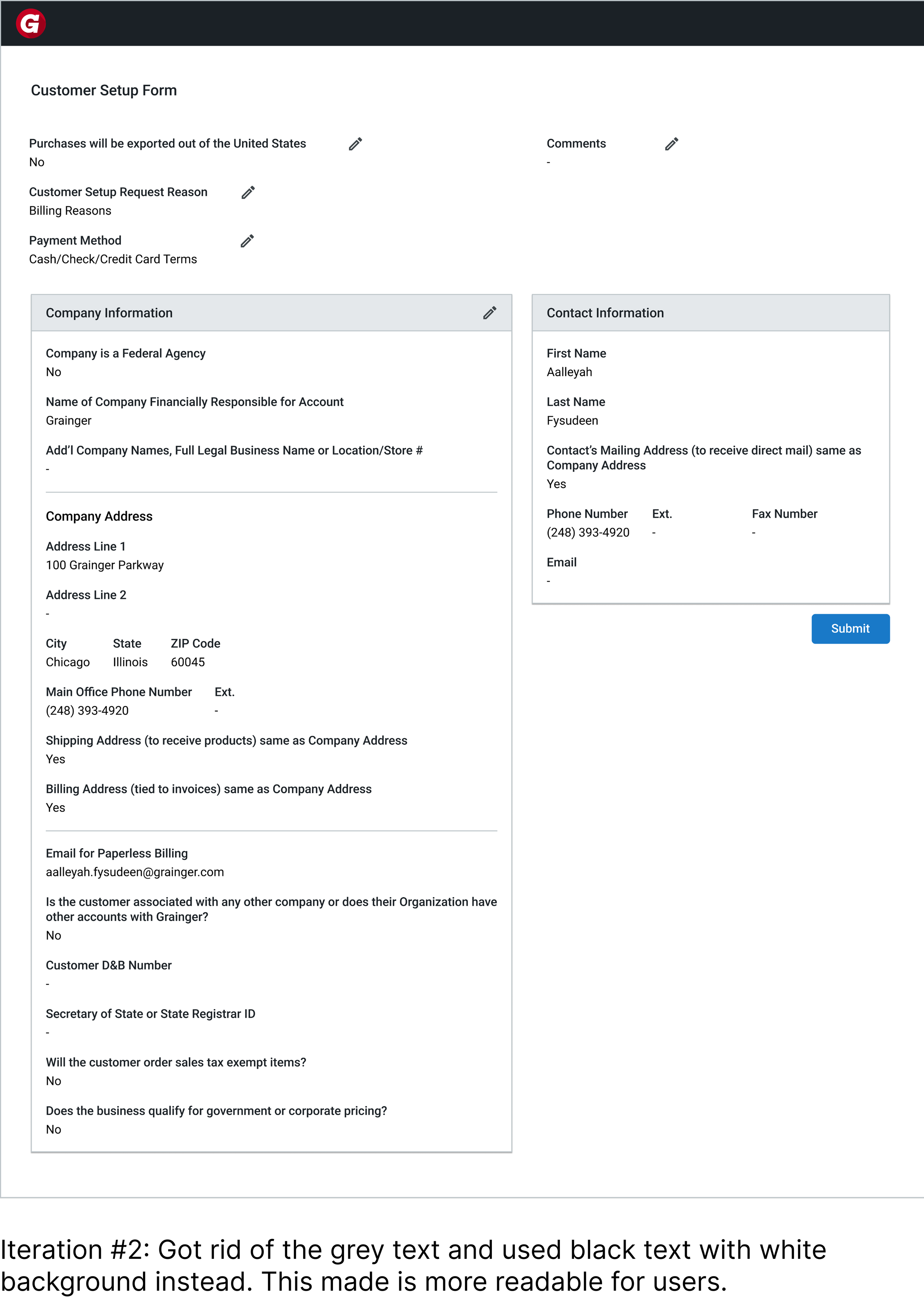
Deciding how to design the layout for the read-only view of the form for the customer to edit.
Key Takeaways
1. Designing for real behavior matters more than designing for ideal behavior.
Even when employees knew the “right” thing to do, they didn’t always follow it in practice. This pushed me to design solutions that guide behavior in the moment, rather than relying on memory.
2.Deeply understanding users through observing their workflow.
Watching employees interact with customers in real time helped me uncover gaps I wouldn’t have noticed otherwise, and ensured my solutions were grounded in how the process actually works day-to-day.
3. Consistent feedback strengthened both the design and its feasibility.
Through weekly check-ins with senior design mentors and biweekly reviews with the PM and engineering lead, I was able to continuously refine my work, align on constraints, and ensure the final solution was both user-centered and technically realistic.